Case Study.
Freelance Flow.
This case study aims to enhance the experience freelancers need to focus on creativity.
Overview.
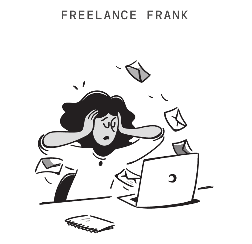
Freelancers have been vocal about the lack of consolidation of various communication outlets.
The vision was to design a simple, intuitive interface that streamlines administrative tasks and communication with clients, allowing users to focus on creativity.


Freelancer
Dashboard
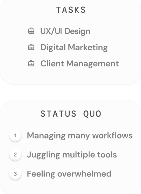

My Contributions.
Secondary research, we decided what type of questions we needed to ask and reviewed data for current freelancer paint points.
In the primary research, interviews and surveys were completed, affinity diagram, to-be scenario.
The design of the wireframe and mid-fidelity prototype was developed and redesign was made through usability testing.
Research and Analysis.
Through peer-reviewed articles and primary research with target users, we discovered that most interviewees expressed frustration with the lack of communication consolidation across the multiple platforms they were using.
Quotes.
“Will I be able to communicate all of my concerns in a manner that the client will understand?”
“I’m using multiple programs to do work and flipping back and forth is not allowing me to be as effective as I could be. ”
Primary Research.
By conducting surveys via Google Forms and one-on-one interviews, we were able to gather both quantitative and qualitative data. The analysis revealed that freelancers struggled to efficiently locate client information for their projects and complete administrative tasks, which contributed to the challenges and unease of starting a new business.
Ideation.
Initial ideas aimed to help ease freelancers' difficulties with the Canadian tax system. However, further research revealed that most freelancers were seeking a consolidated communication tool. Communication was fragmented across various channels and considered inefficient. To exceed client expectations, freelancers wanted a streamlined process for meeting deliverables and timelines within a reasonable timeframe.

Low-fi Wireframes.
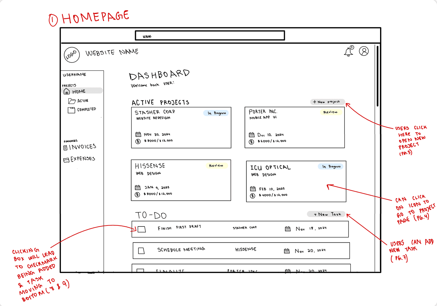
Dashboard/Homepage.
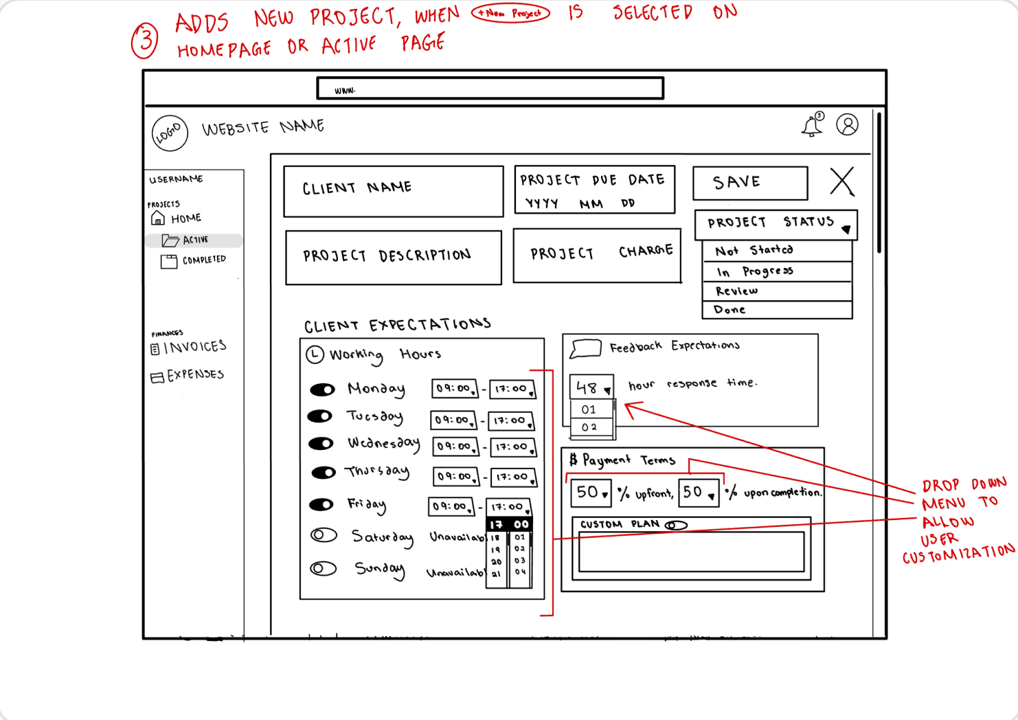
New Project Pop up.
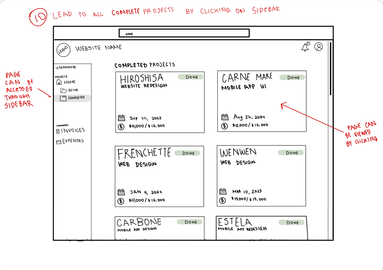
Active Projects Page.
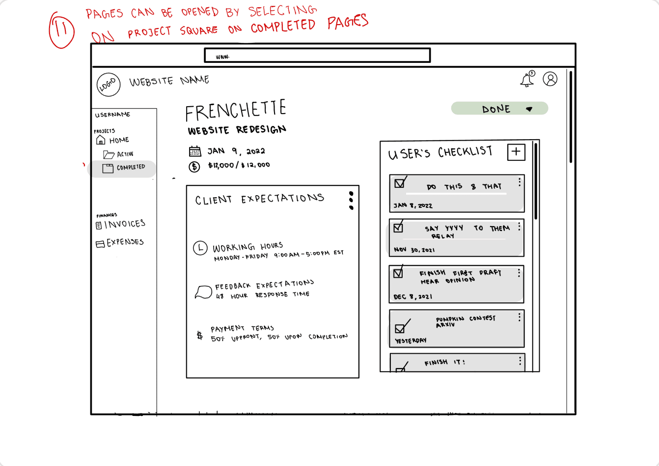
New Task and Checklists.
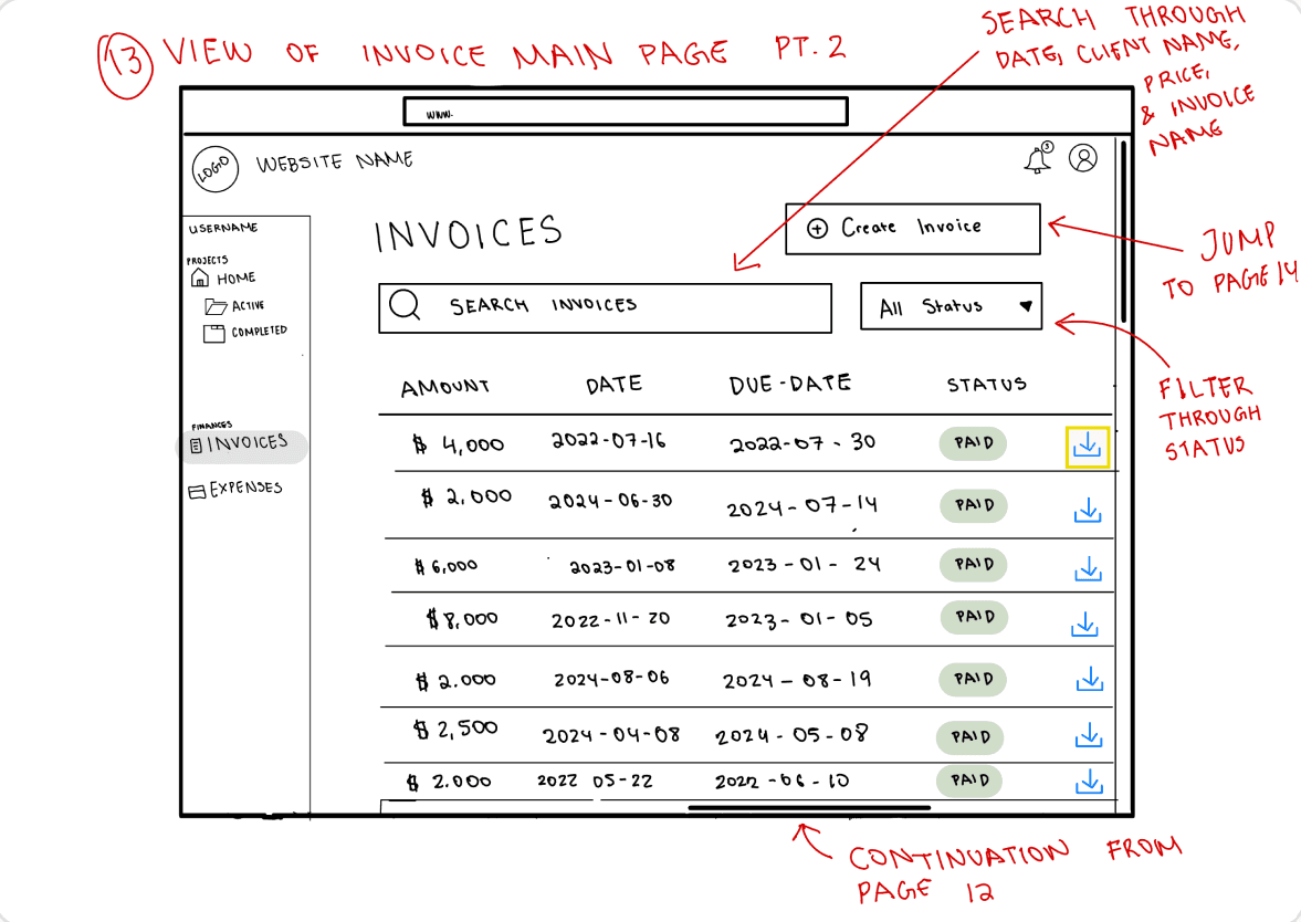
Invoices Page.

New Invoice Pop up.
Lean Evaluation: Low-fi Wireframes.
The process began with creating a low-fi storyboard, which allowed us to refine the idea in more detail. A one-on-one lean evaluation helped deepen our understanding of the tool's design. Next, a mid-fi clickable prototype was developed to better visualize how the tool could be useful.
Evaluation Procedure.
Some evaluations were conducted in person, where participants reviewed wireframes and verbalized their actions and thoughts, offering insights and suggestions for improvement. Other evaluations via video call, with the user sharing their screen to navigate the wireframe and provide feedback on each slide.
Key Findings.
Centralizing tools is critical for freelancers who currently manage multiple platforms.
Users appreciated the comprehensive business management features the platform offered.
Familiar UX patterns, such as drop-down menus and intuitive navigation, enhance usability.
However, balancing feature depth with interface clarity remains a key priority.
Recommendations.
Implement a robust search function for dates, projects, invoices, and expenses.
Display critical client information, such as work hours, deadlines, and milestones.
Add drag-and-drop features for uploading files and add automated receipt categorization.
Clarify invoice transaction IDs and allow better receipt organization.
Mid-fi Prototypes.
Dashboard/Homepage.

New Project Pop up.
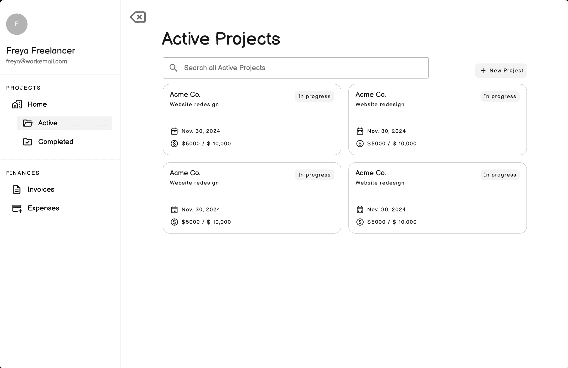
Active Projects Page.
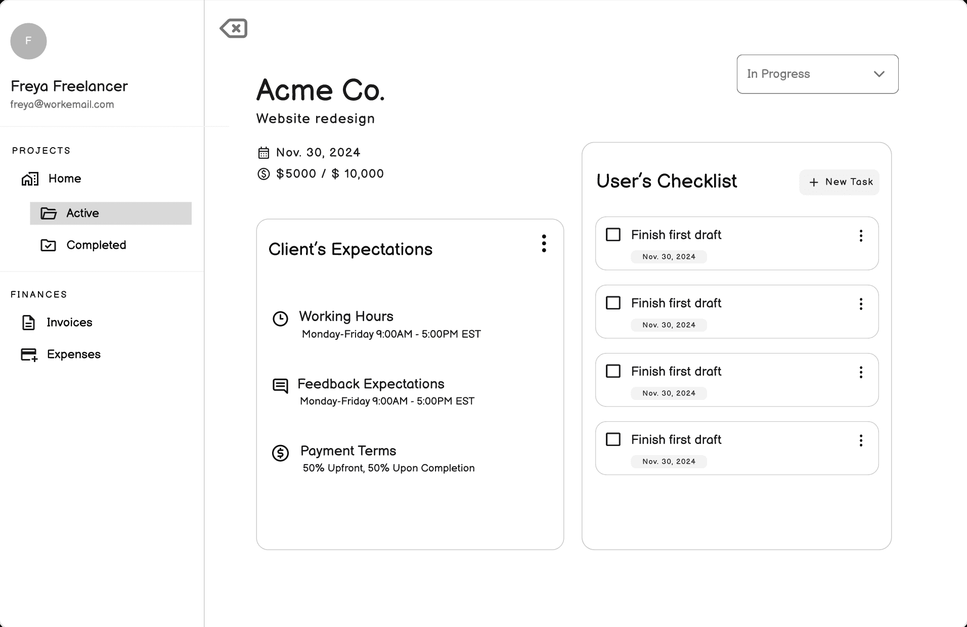
New Task and Checklist.

Invoices Page.

New Invoice Pop up.
Usability Evaluation: Mid-fi Prototype.
The usability test was designed to evaluate the functionality and user experience of the Client Management Dashboard. Participants were asked to complete three tasks that represent key platform interactions, allowing us to identify strengths, usability issues, and areas for improvement. These tasks simulate real-world workflows, ensuring the platform meets user needs effectively.
Evaluation Procedure.
The evaluations were conducted via Google Meet using screen sharing, allowing for real-time observation of the participant’s interaction with the prototype. During the session, the participant was asked to complete three specific tasks while thinking aloud, providing detailed feedback and comments throughout the process.
Key Findings.
Many aspects of the website were intuitive and user-friendly.
Clear feedback mechanisms and improved task management from the Dashboard were important.
Consistent sorting functionality across pages was highlighted as crucial for usability.
Maintaining intuitive elements and responsive features is key to reinforcing platform strengths.
Recommendations.
Increase visual feedback for actions.
Create ability to check off tasks directly from the Dashboard caused inconvenience.
Include more sorting options on the “Invoices” and “Expenses”.
These usability issues disrupted workflow and led to frustration.
Lessons to Takeaway.
Details in a mid-fi prototype are crucial in convincing your audience into the final product.
Small details in a mid-fidelity prototype can make a big difference in shaping how users perceive the final product. These nuances demonstrate attention to detail and enhance the overall user experience, making it easier to sell the idea.
An initial idea can give root to greater ideas.
Starting with a simple concept can be the foundation for something much bigger. Initial ideas spark creativity, guiding you through iterations and refinements that eventually lead to a fully developed solution.
The process of designing is formulaic.
Designing involves more than just creativity. It follows a repeatable process. From research to wireframing, testing to iteration, design relies on a structured method that leads to successful outcomes.
Complexity is not always needed.
Simplicity often beats complexity in design. A straightforward, easy-to-understand solution is often more effective and user-friendly than a specialized, complex tool, which can overwhelm users.
Being structured in Figma can help you organize and reevaluate more easily.
A well-organized Figma file boosts efficiency and collaboration. A clear structure helps designers quickly locate elements, stay consistent, and easily pivot or refine designs, leading to a more streamlined workflow.
We can deviate from our initial ideas.
Initial ideas can evolve as research provides new insights. With data and user feedback, it’s possible to pivot or refine a concept, ensuring the design is rooted in real user needs and wants.
Communication skills are very important in group settings.
In team-based design environments, effective communication is key. Articulating ideas clearly, collaborating with others, and understanding different perspectives lead to more cohesive and successful design outcomes.
Insight from users can give you current perspective.
User feedback is invaluable in creating designs that resonate. Gaining insight into their struggles, desires, ensures that the final product addresses real-world challenges and enhances user experience.
Framer 2023